The Queen's Gambit - the photographers perspective on framing and composition
Now and then, it just so happens that I find a movie that visually amazes me. I was blown away by the colors of Grand Hotel Budapest or by the cinematography of Birdman. The Queen's Gambit, a series created by Scott Frank and Allan Scott, is one of those surprises that I have discovered recently.
Steven Meizler the director of photography is quickly becoming one of my favorite cinematographers. I loved what he did with the Godless series and I have started to love his work more and more.
When watching "on demand" content like HBO or Netflix, we no longer have the luxury of taking a commercial break every 20 minutes to grab some snacks or go to the bathroom. We can now hit the pause button whenever we want. The Queen's Gambit episodes are one of those you can pause on almost any frame and look at the brilliant composition.
When you realise that those movies are just a bunch of stills played at a fast pace you activate this self-learning algorithm and start to notice techniques and styles which you can later incorporate into your own photography.
Here are seven composition techniques we can find in the Queen's Gambit.

One of the goals of good composition is to guide the eyes of the viewer through the pictures. This is ideally achieved without your audience noticing too much and leading lines are one of the best techniques you can use. As we tend to follow lines in reality, we do the same when looking at the images. They subconsciously tell us where to look. Especially if they share the same direction. This technique has been used by many master photographers and the series takes a great advance on that. Lines are usually pointing to the main subject Elizabeth Harmon, highlighting her or pointing away to improve the story without using words.
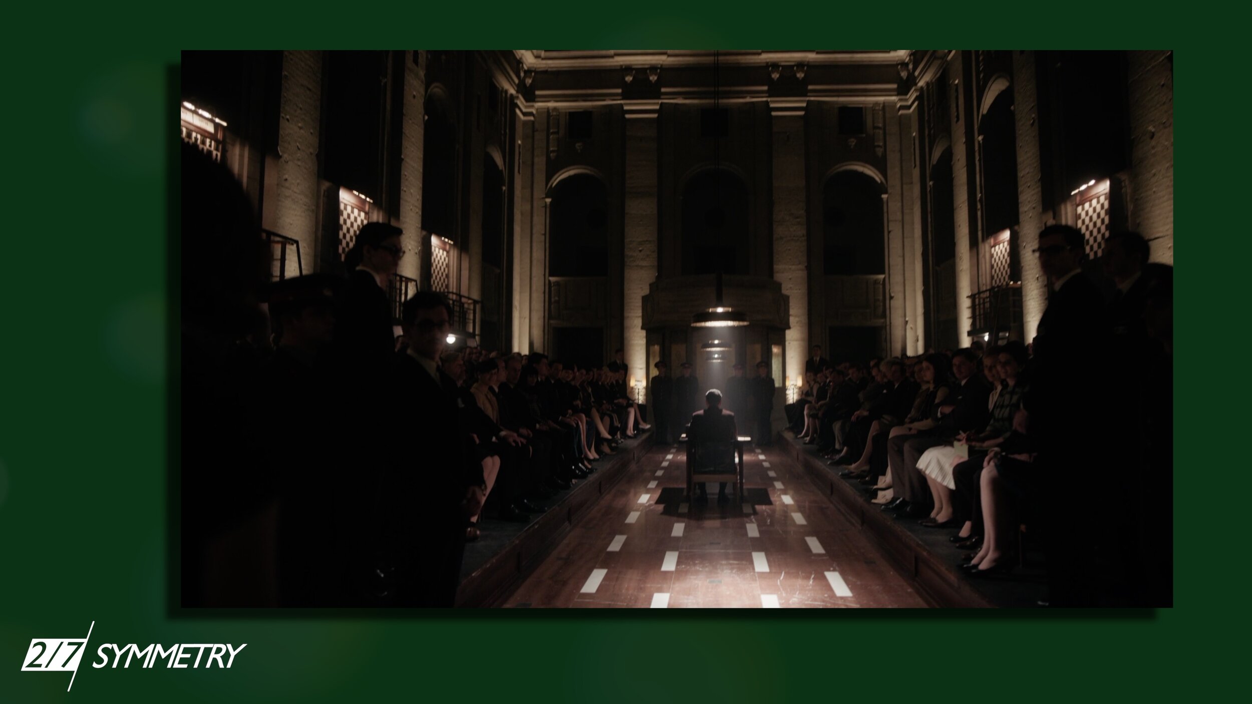
This technique also often comes together with another composition "rule" and that is symmetry. This comes as a more deliberate rule as both symmetrical and asymmetrical compositions have their use. Since we usually tend to seek balance from left to right and weighted more towards the bottom a balanced composition is more pleasing to our eyes. Even though symmetry is mostly used in architecture photography it can be used with people as well. Beth is placed both symmetrically and asymmetrically during the series and as the story progresses those compositions have different impacts.

One thing you can also see is the use of patterns and rhythm. When watching the series I realized the reason I liked a lot of scenes was that they have a lot of visual interests, usually in the background. The use of the 50s and 60s patterns, architecture, and the overall design is outstanding. The rhythm itself dictates how your eyes move around the picture. So when we are out shooting what we can do is to look for a pattern of repetitive elements and disturb that rhythm with a person. Just like in the series.

Speaking of frames and subframes the show uses this technique a lot. It starts with the chessboard which is often shown within a circle which contrasts nicely with the square design of the chessboard.
The show uses some less obvious frames, like when Elizabeth tears apart her bed to be able to look at the ceiling in the second episode to more conventional doors and windows which, for example, in this one isolates the subject, to show the two different worlds of Elizabeth, the schoolgirls and the contrast between them.

The series is surprisingly very dark when we focus on lighting and that often results in a lot of negative space or isolation of the subjects which can be used to evoke all sorts of emotions or tell the audience where it should be looking. Something that is often used in photography to show the emptiness, isolation, or loneliness of the characters.
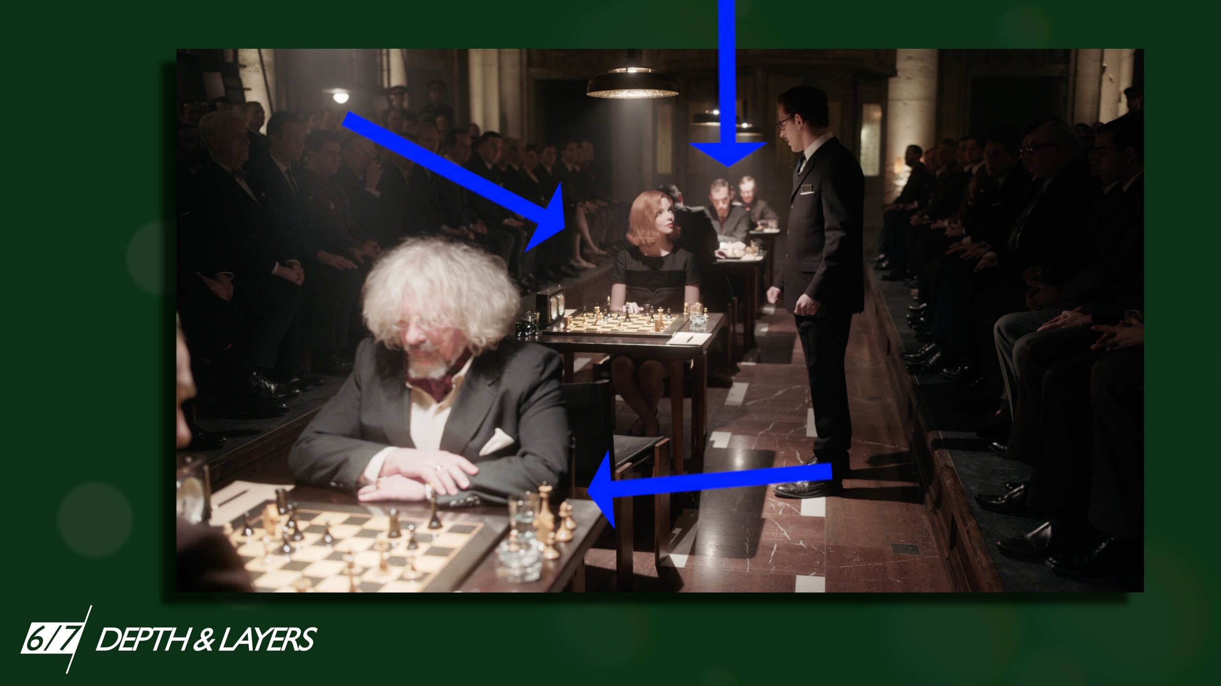
I also like how they worked with depth and layers which helps to establish the character in the world. Like for example in this one where you see the foreground, middle ground, and background which creates depth in the image. Many of those techniques are also used in combination with each other.

And lastly the closeups. You might have noticed that the camera takes extreme closeups/portraits of the characters during the show's intense moments. It usually starts with a classic shot, a reverse shot over the shoulder, and continues closer as the tension grows. Unlike in photography, when filming a movie you can use it to build the tension by holding the shot even longer. Which is impossible in photography, because, well, it is just one frame. However, what both photography and cinematography have in common while using these techniques is that they force the viewer to focus strictly on your subject and help with the message of the shot.
I often try to find excuses why should I sit home and watch TV when there is a lot of other things I should probably be doing. Especially, because, if you are not an astrophotographer you should probably go outside to practice. But, when the pandemic is finally gone, Steven Meizler's camera is going to be my new favourite excuse.
Let me know who is your inspiration and what movies have you discovered recently. You can probably find more composition techniques used in this series. If you do, feel free to leave me a comment below.